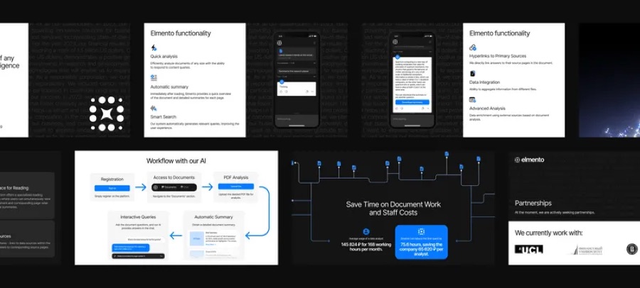
A logo on a white slide tells you very little about a brand. The same logo on a working page, next to real copy, buttons, and images, shows whether the identity actually holds together.
Slides hide problems
In a presentation every element is placed perfectly. Nothing has to wrap, scale, or sit next to awkward content.
A live page removes that protection. Type meets long headlines, colours meet photography, and the system shows what it can and cannot do.
Better feedback, earlier
When people review a working page, the conversation moves from personal taste to how things feel in use. It is easier to say a heading feels heavy on mobile than to judge a logo in the abstract.
That feedback arrives while changes are still cheap.
A brand is not approved until someone has scrolled through it.

What goes on the page
The page does not need to be a full website. It needs enough real content to show the identity under realistic conditions.
It also becomes a useful reference after approval, because the decisions are already shown in practice.
- The logo in the header and footer.
- Real headlines and body copy.
- Buttons, links, and a form.
- Photography or illustration in place.