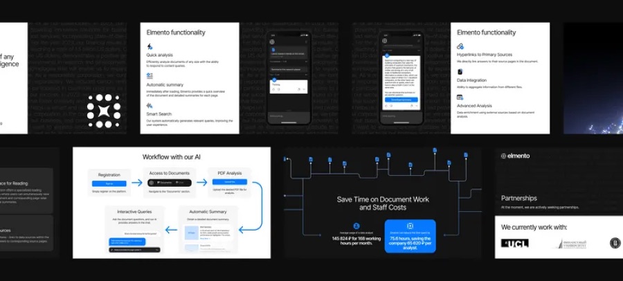
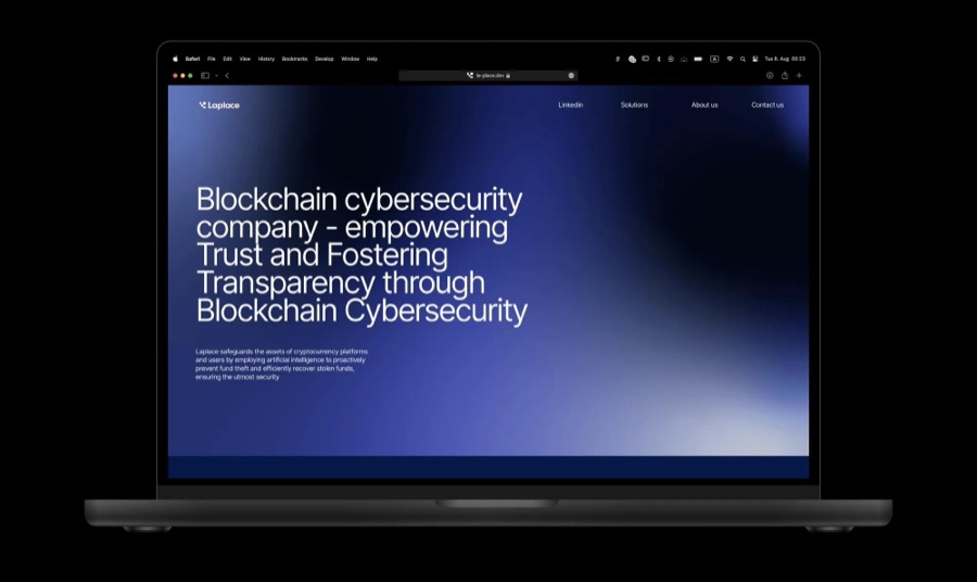
Open a dozen Web3 sites and you will see the same dark background, the same glowing gradient, and the same abstract 3D shape. The category has a uniform, and wearing it makes a project easy to forget.
Why it happens
Teams move fast, borrow references from the same few leaders, and want to signal that they belong. Looking familiar feels safe.
The result is a category where visual identity carries almost no information about what a product does or who it is for.
Start from the product, not the category
The most useful question is not what Web3 looks like, but what this product makes possible for a person. The answer usually suggests a tone, a set of metaphors, and a pace that no gradient can provide.
A trading tool, a wallet, and a community protocol solve different problems. Their brands should feel as different as their users.
Belonging to a category is not the same as being chosen within it.
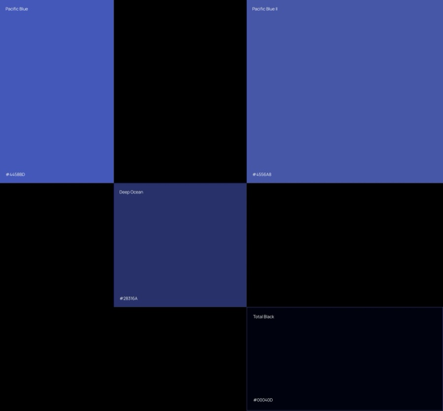
Check for sameness on purpose
Put the new direction next to the closest competitors and remove the logos. If you cannot tell them apart, neither can the audience.
Keep what is genuinely needed for trust and clarity, and push everything else further from the category default.
- Collect the closest competitors in one board.
- Hide names and logos.
- Mark everything that could belong to anyone.
- Replace it with something only this product can say.